Work
The Adirondack Rail Trail App will help visitors explore the trail with an interactive map, local events, and offline access. Built in partnership with the Regional Office of Sustainable Tourism and UpNCoding, the app promotes sustainable tourism and supports local businesses.
Mobile app traffic, impressions, awareness


The Adirondack Rail Trail is a 34-mile, multi-use recreational corridor connecting Lake Placid, Ray Brook, Saranac Lake, Lake Clear, and Tupper Lake. Designed for accessibility, its gentle grade welcomes users of all ages and abilities. Free to the public, the trail encourages healthy, active lifestyles while offering a meaningful way to explore the natural beauty and historic character of the Adirondack region.


With the newly constructed Adirondack Rail Trail already attracting significant use and enthusiasm from local communities, we saw a strategic opportunity to build on that momentum. Our goal was to deepen the connection between users and the region by developing a centralized, user-friendly mobile platform. This app would serve as a single source of truth—offering real-time, location-aware access to trail details, points of interest, and community events—enhancing the overall trail experience while strengthening ties between visitors and the towns along the route.
With the understanding that a lot of the trail runs through remote areas with limited or no cell service, we also prioritized offline functionality. We wanted to reduce user anxiety and ensure a seamless experience by making essential maps and information available without an internet connection—allowing users to explore with confidence, even in the most secluded sections of the trail.
As part of our initial research phase, we engaged local stakeholders to assess interest and gather insights that would shape the app’s direction. Following strong community support, we secured grant funding to move the project forward. With a clear vision in place, we began the search for a development team capable of bringing our app designs to life.
To meet the needs of both trail users and local communities, we designed a cross-platform mobile app—available on both iOS and Android—that serves as a reliable, intuitive companion for anyone exploring the Adirondack Rail Trail.
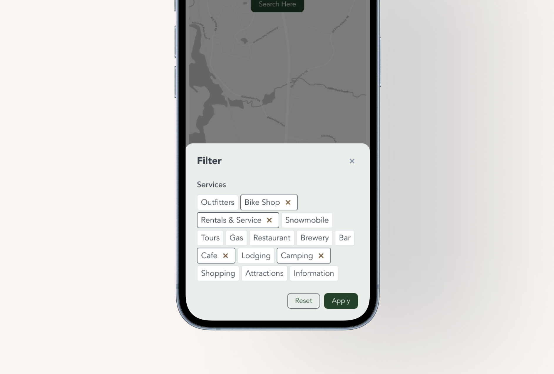
At the heart of the app is an interactive map-based interface, designed with clarity and ease of navigation in mind. Users are greeted with a clean, visual overview of the trail, featuring pins that highlight key locations, points of interest, and local events. We prioritized a lightweight, responsive UI to ensure smooth performance across devices, even in areas with limited connectivity.
Recognizing that much of the trail traverses remote regions, we implemented robust offline functionality. Once synced from a connected location, users can access updated maps and location data without needing cell service. This provides peace of mind for users navigating off-the-grid areas, ensuring they always have essential information at their fingertips. To keep content fresh, the app automatically checks for updates daily when an internet connection is available, while also allowing users to manually refresh content as needed.
The event listing feature allows users to explore what’s happening in surrounding communities, with each event tied to a map pin for geographic context. Any external resources—such as event pages or business websites—open seamlessly in the user’s default browser or maps app to maintain platform consistency and familiarity.
On the backend, we designed a scalable service that integrates directly with ROOST’s existing API. This ensures data accuracy while enabling efficient delivery of offline-capable content tailored to mobile needs. To further support accessibility and usability, we applied key UI/UX practices including touch-friendly layouts, intuitive navigation patterns, and accessibility-conscious design to support a broad range of users.
For this project, I was solely responsible for mapping the user flow and designing both low- and high-fidelity wireframes. Below is an overview of the design process I developed and followed throughout the project:
• Discover: User research - ui/ux best practices for mobile apps
• Determine the sites informaiton architecture and the apps content hierarchy
• Sketch out the user flow
• Meet with internal team to review the general direction of the app
• Establish/create a design system and component library
• Build out the low and high fidelity wireframes
• Connect with UpNCoding to review
• Design -> developer handoff
One of the key challenges in designing this app was adapting established design principles from web projects to a mobile app environment. Unlike websites, mobile apps demand a more streamlined, touch-focused experience with careful attention to limited screen space and offline functionality. Balancing these constraints while maintaining intuitive navigation and clear information hierarchy required thoughtful iteration and user-centered design strategies.
Additionally, ensuring seamless performance across both iOS and Android platforms meant accounting for differing user expectations and system behaviors, which added complexity to the design process. These challenges pushed me to expand my approach and develop solutions tailored specifically for mobile users on the go.
Currently in development.